1
2
3
4
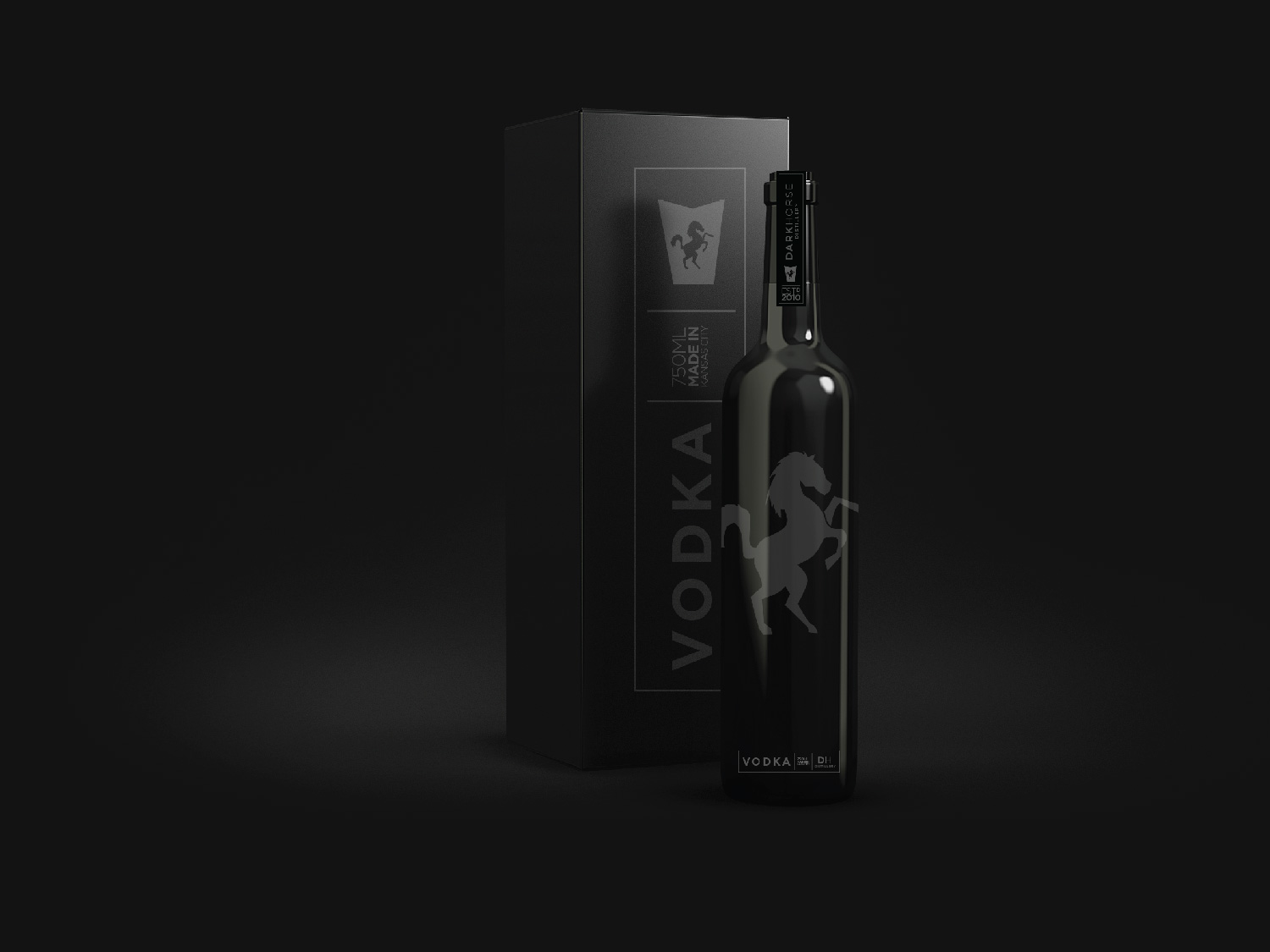
Client // Dark Horse Distillery
Project // Brand Identity and Package Design
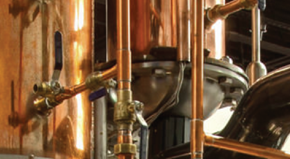
Challenge // Looking to break into the Craft Distilling scene, we wanted to work on naming, brand look and feel, as well as some packaging ideas.
Solution // Once we landed on the name, Dark Horse Distillery, after one of the clients love of horses and being the underdog in the spirits industry, a relatively big space - we quickly moved on to concept and design - where we landed on a simple/modern/urban/contemporary icon of the horses head that also purposes as a badge. The color palette is black, white, and dark blue which evokes the feeling of power, strength, darkness, mystery, timeless and classic . The typography is stark, strong, and mysterious.
Results // The result was a really cool concept and design for the brand to help them launch their business. Since then, the name has changed from DarkHorse Distillery to UnionHorse Distillery due to some legal issues and naming rights.