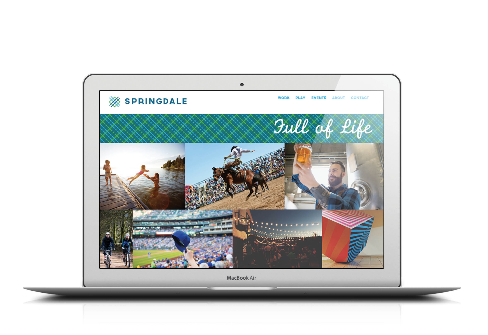
City of Springdale
Client // City of Springdale
Project // Develop a new brand and identity system for the City of Springdale
Challenge // Bring new life and excitement to the City of Springdale through a brand identity system that reflects the community and people who live, work, and play there. Springdale has existed since it’s beginning at the intersection of Emma and Spring Creek - once called Shiloh. A brand that speaks true to all the things the city offers and embraces. Relevant to all of Springdale residents and visitors, a brand that motivates and inspires, classic and stands true over time, unique and ownable.
Solution // A design with intersecting lines that reflect the history of the city, the intersection of life, and literally the intersection of Emma Street and Spring Creek. The creative was inspired by a woven tapestry, spring creek, emma avenue, a thriving downtown, an intersection of life, symbolizing history, innovation, culture, community, the heart of it all, a downtown, the center of NWA, a map, grid, range lines, townships, growth, new direction, a dream for today and a better tomorrow. From its pioneer beginnings to the birthplace of America’s poultry industry, Springdale has a reputation as a leader in agriculture, industry and American hard work. A city of Makers. A city of Culture once known as Shiloh were people have been coming to carve out their very own piece of the American dream. A city of Ingenuity from state-of-the-art leaders in science to pioneers in food processing, a history of innovation, excellence in education. This mark harkens back to the beginnings and nods to the future of great things to come.
Results // Created a new brand identity system for the City of Springdale which has been adapated and is being used all over the city.


Logo Exploration


Photography / Application


